
The Wayfinder Coaching logo is based on Polynesian voyagers who would travel the ocean in search of land, relying solely on nature and experience. "Turn the canoe around and follow the birds. They will lead us to land."
Let's be beautiful first, descriptive second, clear yet unique. This male hair salon prides itself on traditional scissor and comb hair cuts so we made sure to recongize what makes them special.
A mark is a vessel that delivers a potential supporter to your business. What and how it communicates determines whether or not they board.


Cultural legal representation that extends outside of the U.S. The crossing of borders.
The positioned upward expressing an inviting playfulness. The lines resemble a tree. The letters become leaves. The placement of FOUNDATION, the ground. Two figures represent people coming together to form something strong and stable. The logo conveys strength, structure, outreach. It's playful in its rendering and soficticated in its dual imagery.

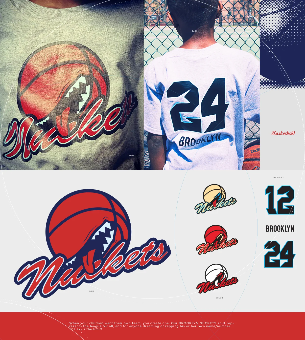
Fully custom print collateral.
Quite the balancing act.


Brands aren't designed, they're applied.

A wave. The negative space below the wave is the unique shape of a bear claw. A bear beneath the water.
Water drops. Bear claw. Crown.


